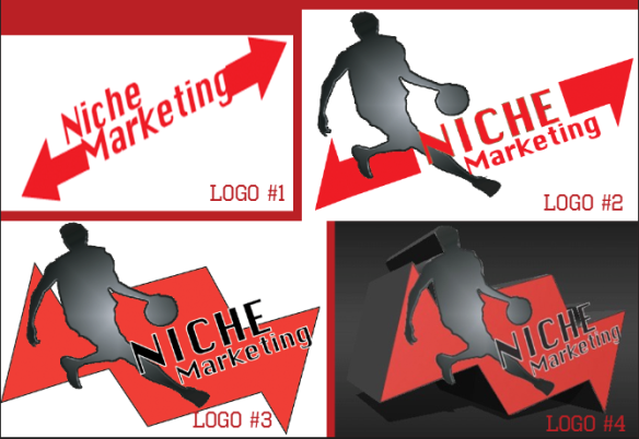
When creating a logo for my brand “Niche Marketing” I wanted to make my brand unique, eye popping and pleasing to the eye. In Logo #1 one can see the brand name alongside with arrows that represent the variety and reach that the brand has. however it lacked elements , which make it forgettable and make the logo seem empty. In Logo #2 you can see an image of an individual playing basketball , which catches attention however the arrows take away from the logo and cause distraction , from the name of the brand, which defeats the purpose of creating a logo. The purpose of a logo is to insure that individuals associate the brand name with the logo. In Logo #3 the arrows are narrowed in together making it all flow together in the center with the image going alongside with the brand name (the basketball is the dot on the I) the arrows coming together in the middle focuses your attention to the center of the logo. Logo #4 is the finished product , in a 3d style type image making it eye popping and attention grabbing alongside with the black background which makes the red logo stand out more.
